Capucine Merlin
What's this?
Design of the visual identity for the pedicure - podiatrist Capucine Merlin. I wanted a less medicalized brand image, but more dynamic and fun. A more impactful, contemporary and easily recognizable design.
Focus
Branding, Logotype
Colors
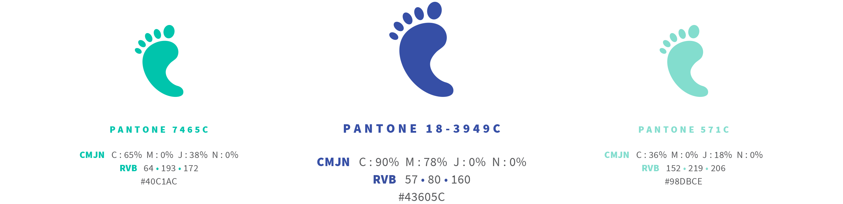
I wanted a playful logo, but always wanted to keep the colors popular in the healthcare industry: blues and greens.
Blue is a popular color, which represents knowledge and reliability. And green, a color of balance which allows to harmonize the content especially in the medical professions.
The color range includes three contemporary shades, with dark blue being the main color.
Blue is a popular color, which represents knowledge and reliability. And green, a color of balance which allows to harmonize the content especially in the medical professions.
The color range includes three contemporary shades, with dark blue being the main color.
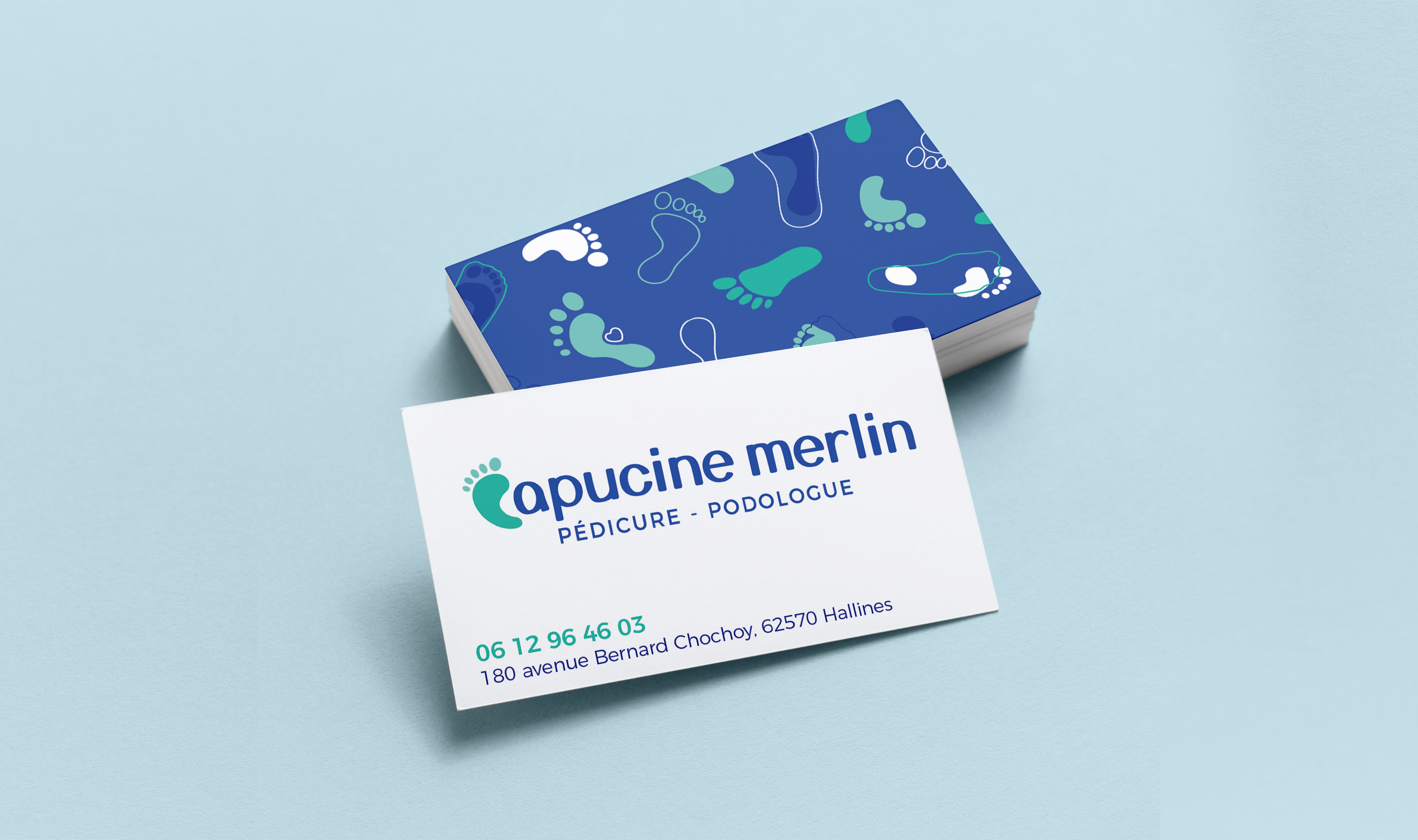
Logotype
C of Capucine was created in the form of a foot icon to fit into the typography and form a whole.
Typography is rounded to represent the rounded appearance of the feet and to better integrate with the icon.
The icon is in a different color to make the profession visible in the blink of an eye!
Typography is rounded to represent the rounded appearance of the feet and to better integrate with the icon.
The icon is in a different color to make the profession visible in the blink of an eye!
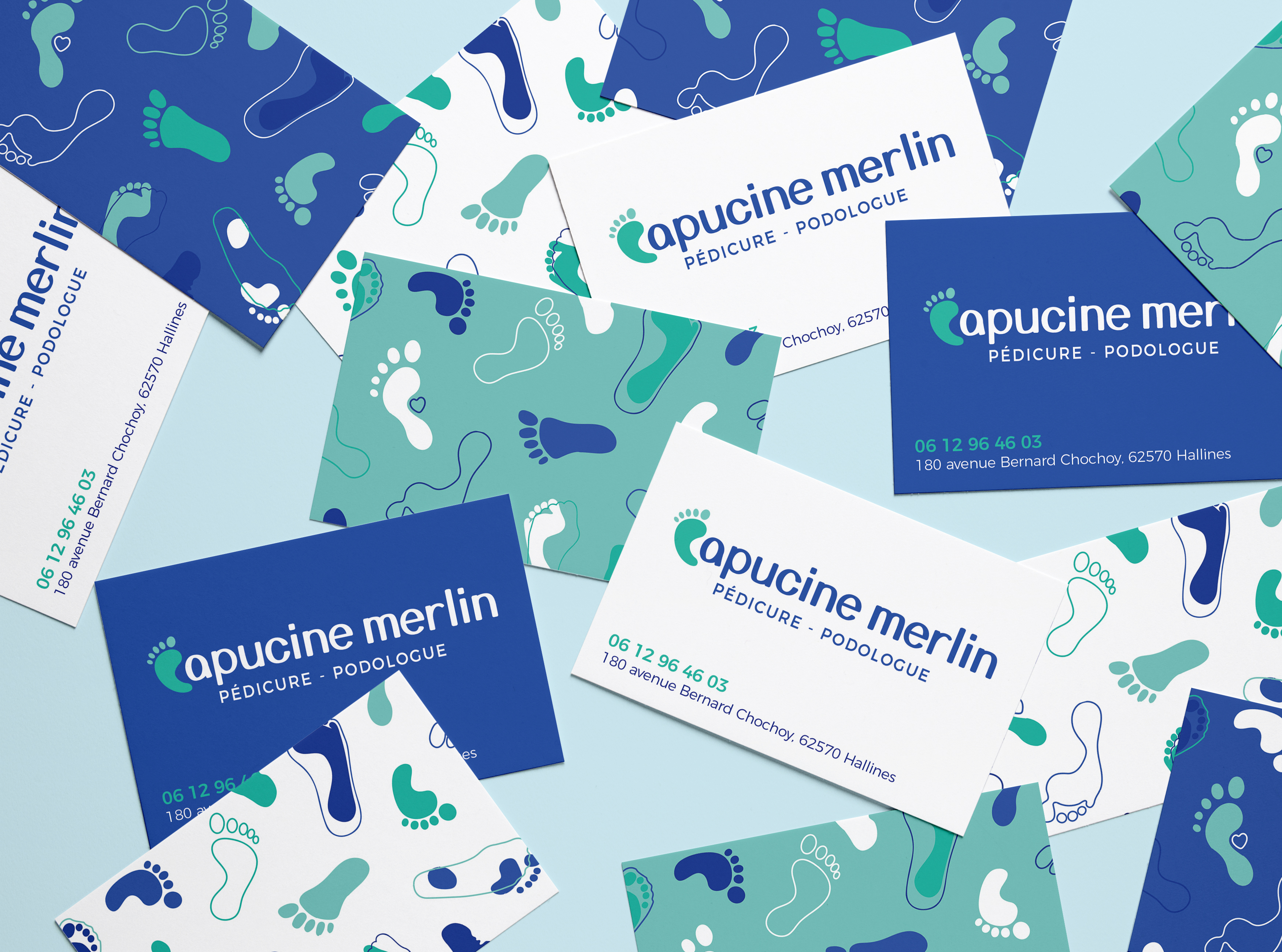
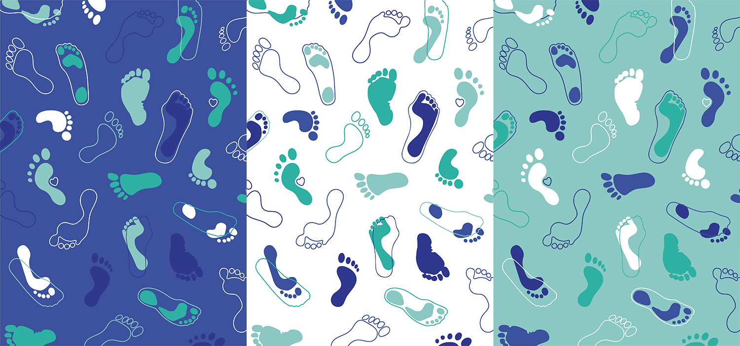
Pattern
Creation of a unique and visually attractive all-over pattern, which can be found on communication media.
This makes it easy to differentiate it from its competitors, and to immediately recognize Capucine Merlin's graphic identity thanks to this personalized universe.
The design represents the diversity of feet and footprints visible thanks to the podoscope. Main pattern is dark blue, but variations depending on the color range can be used.
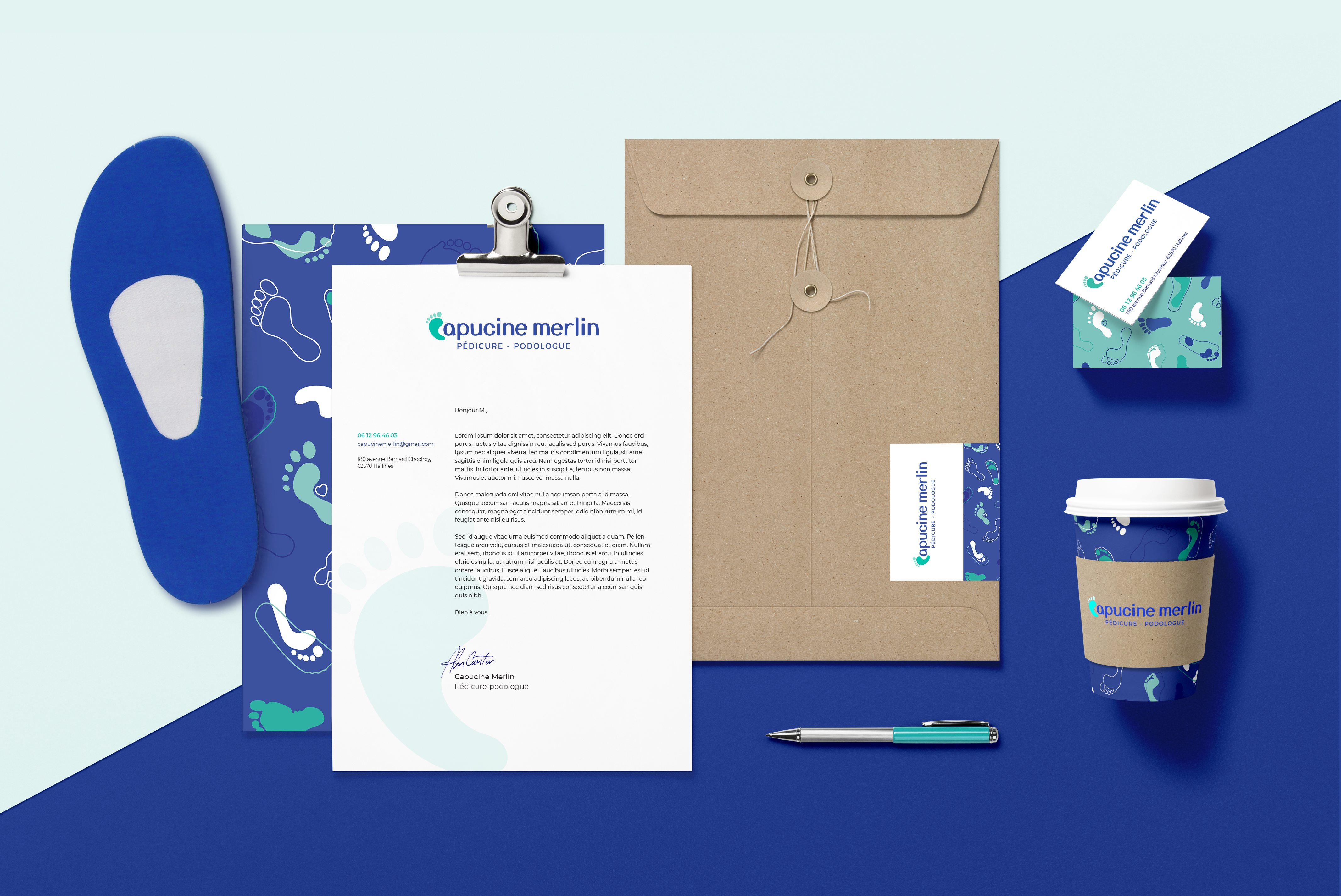
Branding
Application of the graphic identity on the brand's communication media.