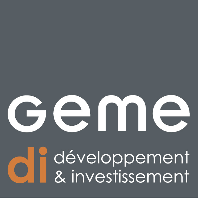
Geme Di
What's this?
Creation of the new visual identity of Geme Di, a Swiss real estate and construction project management company. The customer wanted to be easily identifiable even from afar, especially on construction sites.
Agency
Ores group
Focus
Visual Indentity, Logotype, Branding, Brandbook
Old identity :
Strong elements to keep:
_ Geme in lowercase, offering usability, as well as good readability.
_ Capital G at the height of the lowercase letters, which brings dynamism.
_ Color orange, synonymous with communication and security.
_ Geme in lowercase, offering usability, as well as good readability.
_ Capital G at the height of the lowercase letters, which brings dynamism.
_ Color orange, synonymous with communication and security.
New identity :
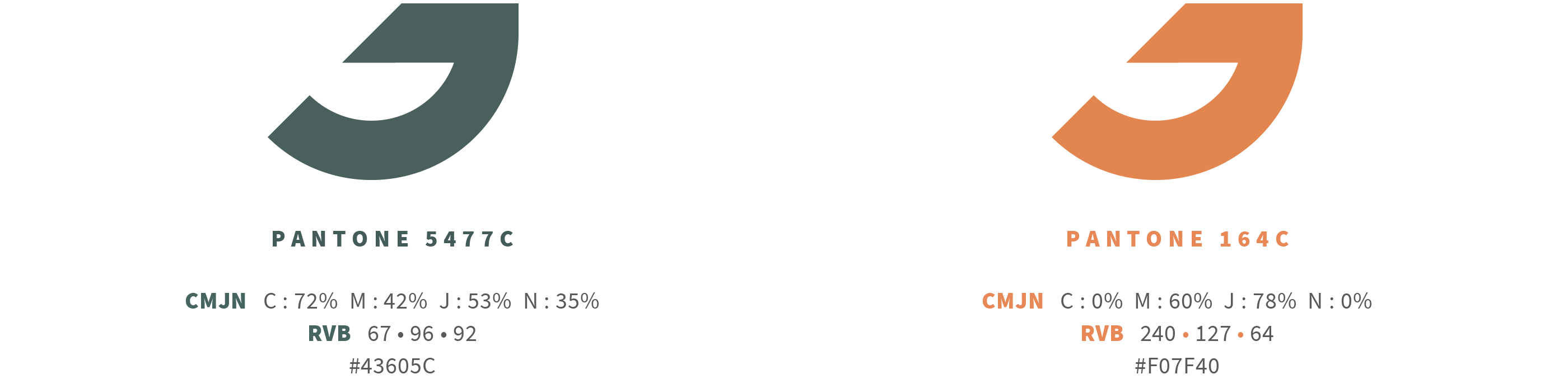
Colors
Green color represents the sustainability side of the projects, as well as the ecological spirit of the company. The warm aspect is also highlighted.
Orange coloris a very strong identity marker, symbolizing the energy and dynamism of Geme. It fits well into the landscape and is visible from a distance.
Orange coloris a very strong identity marker, symbolizing the energy and dynamism of Geme. It fits well into the landscape and is visible from a distance.
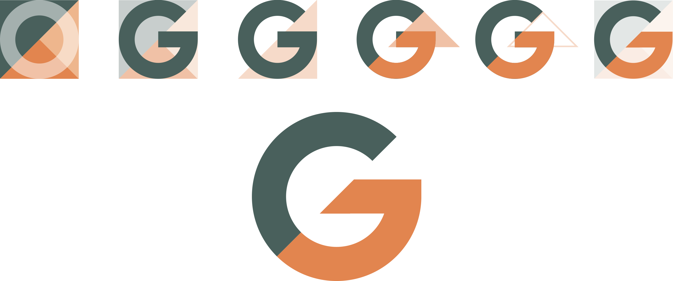
Isotype
Shapes and geometry are a symbol of construction. I worked on the geometry of the elements and on the shapes, to arrive at a striking isotype.
In the G is anchored an arrow, a comma rising up. The comma forming an upward arrow, highlights the ecological and sustainable side of the brand.
It is a design visible and understandable by all in the blink of an eye!
In the G is anchored an arrow, a comma rising up. The comma forming an upward arrow, highlights the ecological and sustainable side of the brand.
It is a design visible and understandable by all in the blink of an eye!
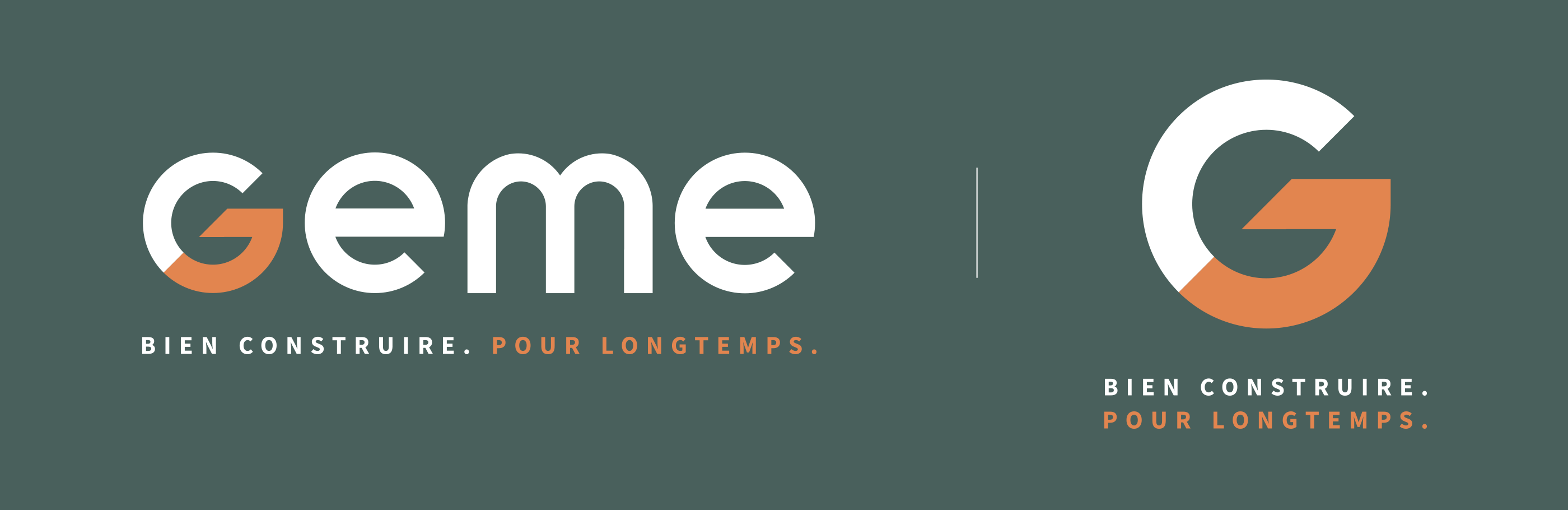
Logotype
Modernization of the logotype and redesign of the typography, integrating the identity symbol.
This typography was designed especially for the logotype. Each letter is symmetrical, the crosspiece is centered on the height of the bodies of letters.
The logotype can be used in its entirety or simply its isotype. Geme logotype will mainly be used without its signature.
This typography was designed especially for the logotype. Each letter is symmetrical, the crosspiece is centered on the height of the bodies of letters.
The logotype can be used in its entirety or simply its isotype. Geme logotype will mainly be used without its signature.
Declination of logotype on the colorimetric range. The identity symbol is always in orange.
To see its different possible uses, consult the brandbook!
To see its different possible uses, consult the brandbook!
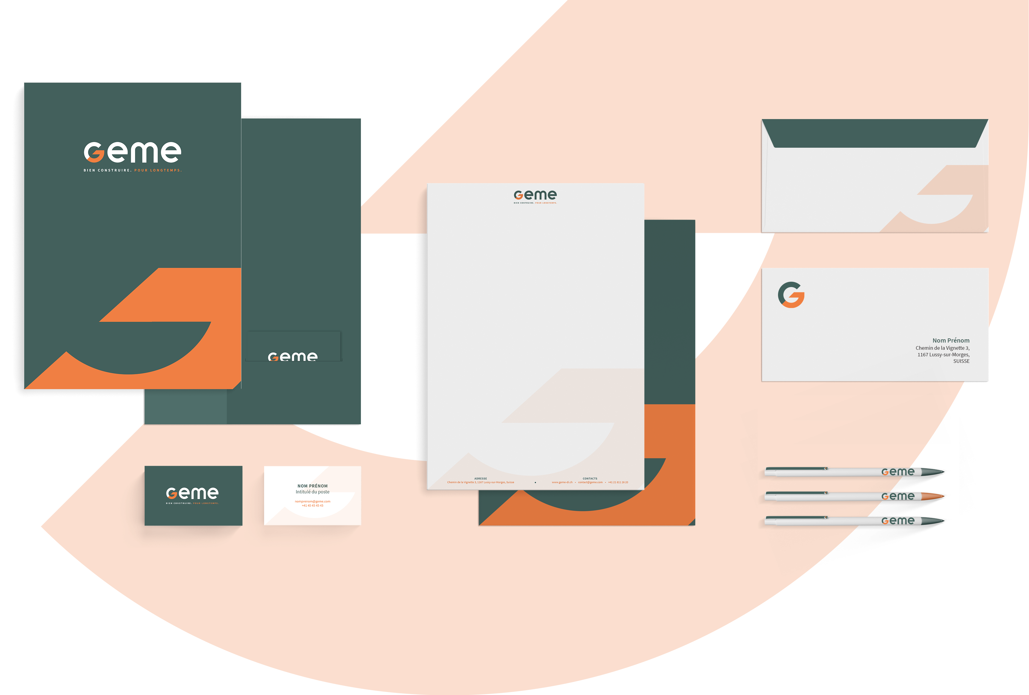
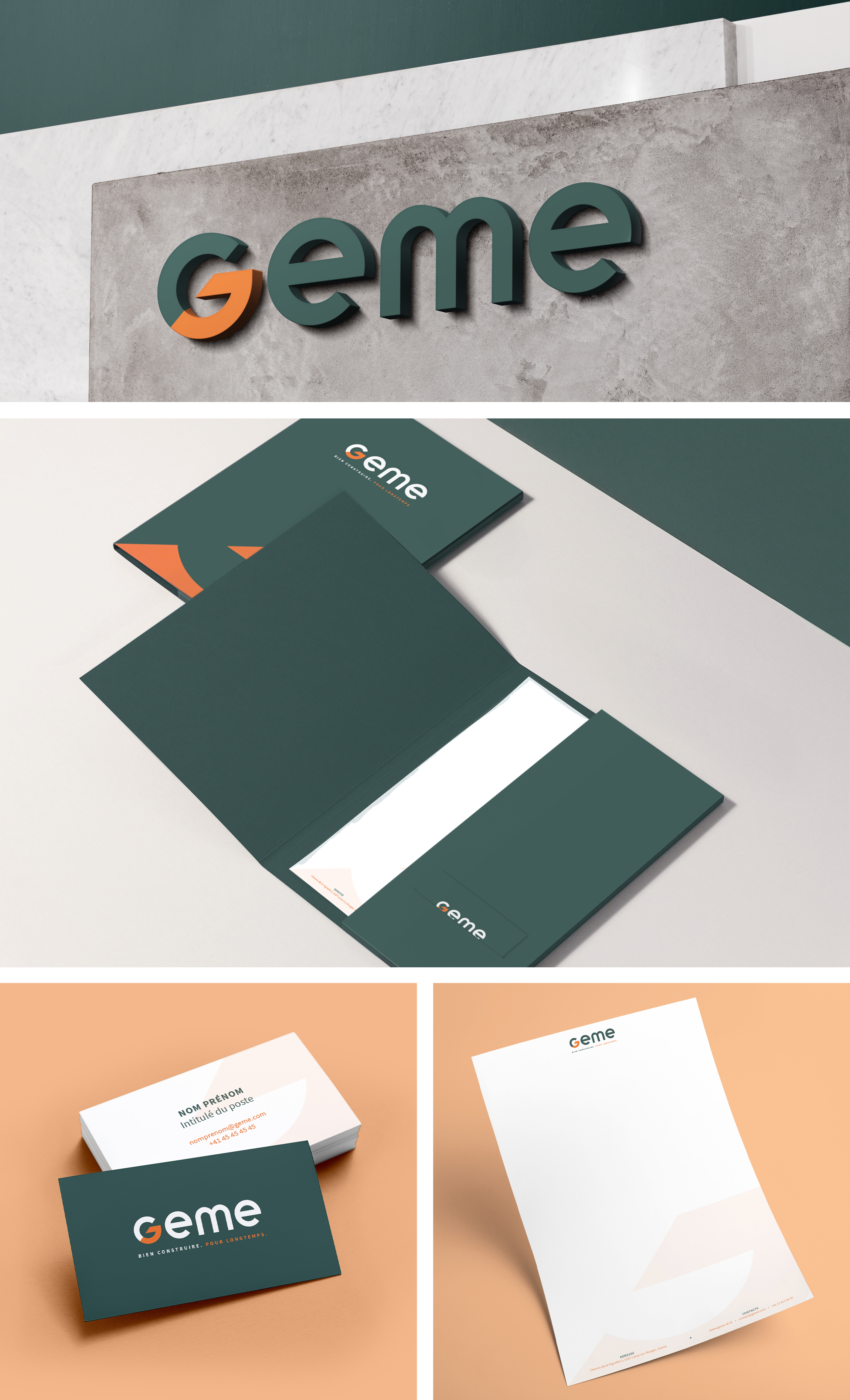
Branding
Application of the graphic identity, the logotype, the typography and the identity symbol on the brand's institutional communication media.
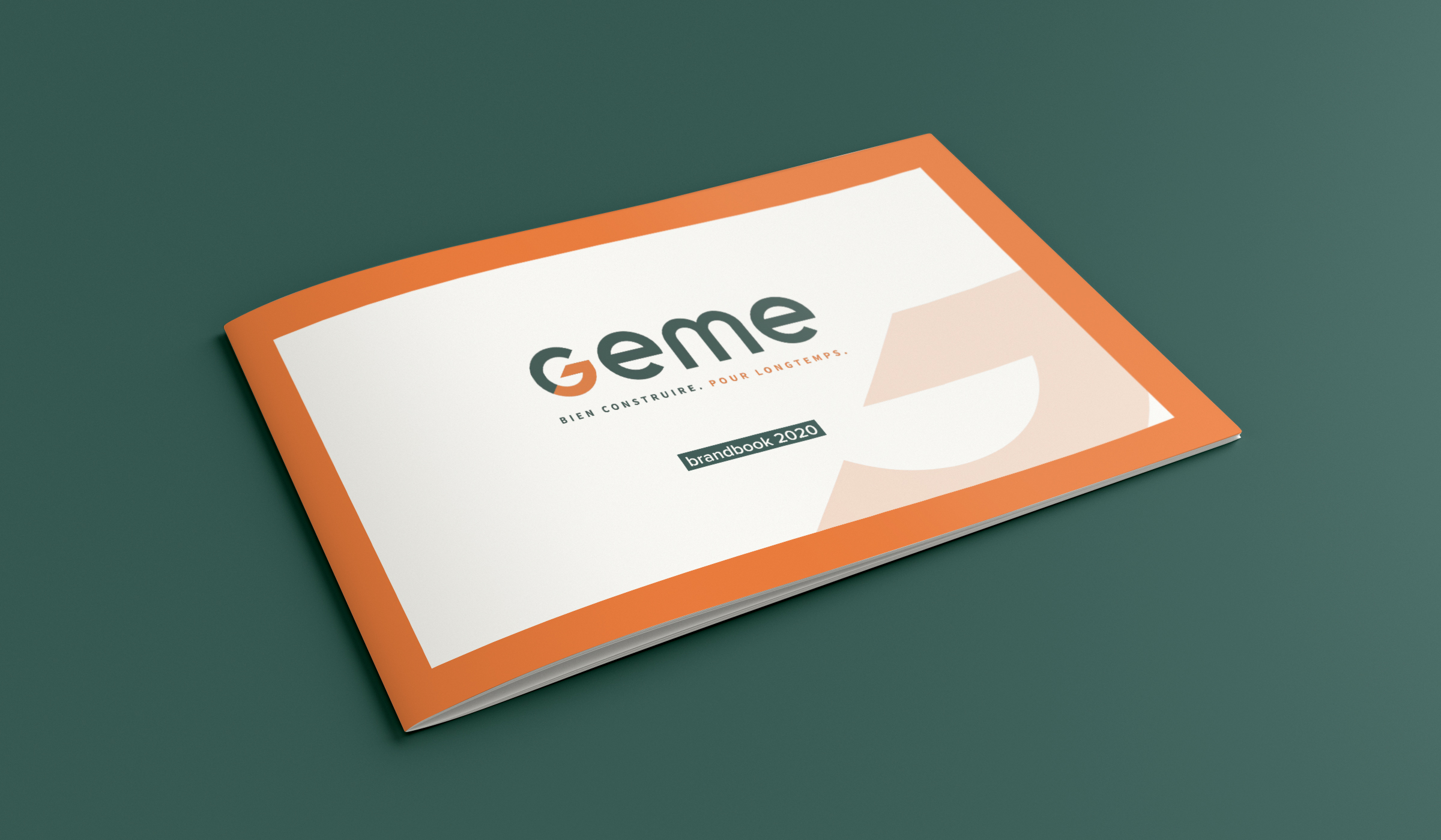
Brandbook

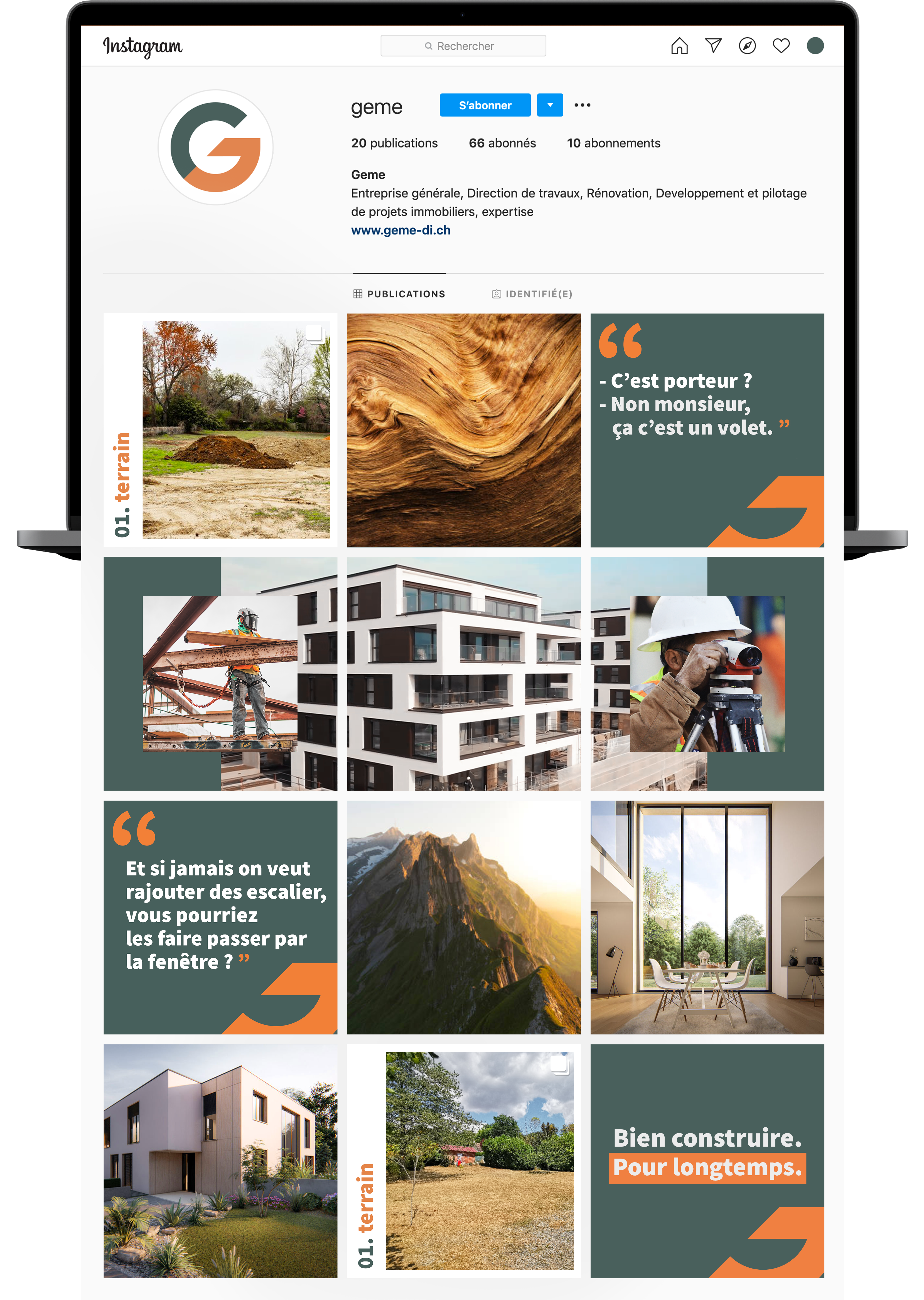
Social media
Launch of the campaign for the new communication territory of Geme. Posts creation with engaging content.
Here is Geme's new Instagram feed!
Here is Geme's new Instagram feed!
Digital film
Concept: Inspired by nature.
We created a real parallel by mixing images of buildings and nature, which are strongly linked. The aim is to show that Geme takes its environment into account in order to build well.
We created a real parallel by mixing images of buildings and nature, which are strongly linked. The aim is to show that Geme takes its environment into account in order to build well.
